- Skip to main content
- Home
- Section 1
- Section 2
- Section 3
- Section 4
Section 1: What is it like to be a blind Internet user
Assistive Technology
- Screen readers are software that translates screen contents into synthetic speech.
- Refreshable braille displays are hardware devices containing a strip of retractable braille pins, allowing braille characters to be generated on the fly.
Links to assistive technology vendors can be found in the 'resources' section.
Both categories provide a linear information stream (either speech or braille), which means that the user can only focus on one element at a time.

Example of a refreshable braille display

'Feeling' through a website
What is Website Accessibility?
Whether or not a blind user can access a website in an effective, efficient and pleasant way is mostly dependent on the site's level of accessibility.
A website is 'accessible' when its content is available to everyone, regardless of any visual, auditory, cognitive or motor impairment.
Guidelines have been specified to help web designers make accessible websites. The most widely used guidelines are the Web Content Accessibility Guidelines (developed by the World Wide Web Consortium), and the 'section 508 of the rehabilitation act' guidelines.
Is the Internet currently accessible?
Web designers are still often unaware of accessibility guidelines or choose to ignore them.
One of the major reasons for not following these guidelines is that the target group (impaired users) is often considered to be too small for companies and designers to invest the necessary time, money and effort.
Accessibility guidelines are often validated through automated evaluation tools that help website designers locate accessibility problems in their pages, but common sense is also needed to make the website truly usable for blind people. For example, an image might be given a textual description which does not really describes the actual function of the image.
Basic steps to make a web page accessible
Web designers can easily increase the accessibility of their page by observing the following rules (based on the W3C Web Content Accessibility Guidelines):
- Always provide a textual description for images, tables and embedded content (for instance movies or applets).
- Use correct markup to distinguish between page elements such as headings and paragraphs, so that screen readers can navigate effectively.
- Provide 'skip links' which allow the user to skip directly to the main page content instead of having to listen to the page menus, banners and other content preceding the main information.
- Make sure that form elements have clearly associated labels as well as a comprehendible function.
- Make sure the page can be navigated by keyboard alone, do not allow navigation by Flash movies or JavaScript code requiring mouse actions.
- Make links self descriptive rather than context dependent. For example, instead of linking only one word (as in the link "click 'here' to find out more about this book", use the full context as in the link: "Click here to find out more about this book".
Movie clips
Movie clip 1: 'Introduction to the screen reader' by UW-Madison
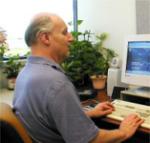
In the following movie, created by the University of Wisconsin-Madison, a basic introduction to screen readers is given. A screen reader user describes the basic interactions, as well as the advantages and disadvantages of screen reader use.
Movie clip 2: 'Keeping Web Accessibility in Mind' by webAIM
This movie clip describes the challenges which disabled people face when using the Internet, as well as reasons to make the web accessible for different disabilities.
Examples of accessibility issues
Example 1: A search banner on Amazon.com
The following screenshot shows a search bar on a major website called Amazon.com. Although sighted users will most likely have little problem understanding where to enter their search query, the audio sample shows that the bar poses a greater challenge when accessed through a screen reader.

Play recorded screen reader output for the Amazon.com search bar (requires flash player 6 or higher)
Stop all sound
The example illustrates that visual controls such as images can make a site more intuitive to use for sighted users. However, without a clear textual description the function of the control is unknown to a blind user. Also, while a sighted user may find it obvious to enter a search query in the first textbox, the screen reader only states 'edit' without specifying what the textfield's purpose is.
Example 2: images without a textual description on Asus.com
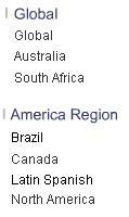
This screenshot contains a sample from a list of country names on www.asus.com. The user can select in which language the website should be viewed.

Play recorded screen reader output for the asus.com sample (requires flash player 6 or higher)
Stop all sound
Although the names are easy to read for a sighted user, it appears that most of them are incomprehensible when translated into speech. The reason for this is that the names are actually images of names, while no textual alternative (through an ALT or TITLE attribute) has been provided.
Example 3: table on TV guide.com
Tables are excellent for displaying relations, but are less intuitive when accessed as a linear information source. This example shows a TV Guide sample of listed television programs, sorted by network and time of airing.

Play recorded screen reader output for the tv guide.com sample (requires flash player 6 or higher)
Stop all sound
Although the original table contains more than 300 rows (one row for each TV channel), even this sample of three rows shows that it is difficult to comprehend at which specific time each program airs. Whereas a sighted user might glance at the top row every now and then to see which time belongs to each column, a blind user has to memorize this information or navigate back to the first row to check the column names.

