14.1: Ensuring Accessibility and Section 508 Compliance for the Recovery.gov web site
Jonathan Lazar, Dan Green, Tina Fuchs, Alice Siempelkamp, and Michael Wood
I. Introduction
The American Recovery and Reinvestment Act (the Act) became law on February 17, 2009 with the intention of infusing $787 billion into the United States economy to create jobs and improve economic conditions. The Act (informally known as “the Stimulus Bill”) established an independent board, the Recovery Accountability and Transparency Board, to oversee the spending and detect, mitigate, and minimize any waste, fraud, or abuse. While the Act was politically sensitive, the Recovery and Transparency Board (the Board) is non-partisan, and does not decide who gets funding. The Board is chaired by Earl Devaney and is made up of 12 Inspectors General from various federal agencies.
The law required the Board to establish a user-friendly website, Recovery.gov, to provide the public with information on the progress of the Recovery effort. There were many significant challenges in building and maintaining such a website, including simplifying complex information for a broad audience, making government statistics available in an interesting manner, providing access to the projects and awards in local areas through maps, charts, and graphs, and allowing for reporting of fraud, waste, and abuse right on the site. In addition, the Act laid out very specific requirements that influenced the design of Recovery.gov, including that the site had to provide “relevant economic, financial, grant, and contract information,” “provide a link to estimates of the jobs sustained or created by the Act,“ and “provide a means for the public to give feedback.”
Initially, the General Services Administration and Office of Management and Budget created a site, Recovery.gov 1.0, which launched on February 17, 2009, the day the Act was signed into law. However, to meet the stakeholders’ demand for richer data, geospatial features, and web 2.0 functionality, the Board made the commitment to rebuild and redesign the site. In July, 2009, the redesign and rebuilding process began. Ten weeks later on September 28, 2009 Recovery.gov 2.0 was launched. One month later, on October 30, 2009, data on 130,000 Recovery awards was displayed in charts, graphs, and geospatial maps. The site expanded the 2500 data points on Recovery 1.0 to approximately 250,000 and increased the number of pages from 250 to more than 90,000. In addition to the recipients of Recovery funds reporting every quarter, Recovery.gov 2.0 displays weekly financial reports for the 28 federal agencies administering funds, as well as all the findings issued by 29 Inspectors General who have oversight of those funds.
Recovery.gov 2.0 uses simple elegant design, yet incorporates numerous web features that internet users expect: videos, advanced geospatial capabilities, downloadable data, and social media components, such as Flickr, Facebook, and Twitter. All this functionality expands the ability of the American taxpayers to track Recovery funds - how and where they are spent. Charts, graphs, and maps, which are continually enhanced and refined - offer both telescopic and microscopic views of Recovery projects across the country, from a national overview down to specific zip codes.
The goal was transparency at a scale not seen before in the federal government.
To meet the challenge of displaying information from thousands of Recovery fund recipients, and providing simple overviews of how money was distributed and spent, the Board arranged extensive focus groups to take the public’s pulse and met with a broad group of stakeholders to determine their interests and needs. This ranged from the public, to States, Congress and the Administration.
A major goal for Recovery.gov was meeting the requirement that the site be accessible to those with disabilities, such as visual, hearing, and motor impairments. Since the site is for the general public there was a significant commitment by the Board to ensure the fullest access possible. Generally, Section 508 requires that individuals with disabilities who seek information or services from a federal agency have access comparable to that provided to the public who do not have disabilities (see www.section508.gov for more information). During the period of site development, we were aware that the Section 508 guidelines were undergoing review (known as the “508 Refresh”), but draft guidelines had not been published or approved, so the legal requirement for Recovery.gov was to meet existing regulations. When new regulations are released, the entire site will be re-evaluated for compliance.
After an intensive process to determine specific requirements, prototypes of Recovery.gov 2.0 were created using best practices for design, usability, and accessibility. At a broad level, three main approaches were used to ensure compliance with Section 508:
- Testing with individual users, including those with perceptual and motor impairments to supplement automated evaluation, is a major design requirement in ensuring 508 compliance
- Routine testing for compliance with Section 508 of the Rehabilitation Act, including testing of contrast and color schemes, are done quarterly using Watchfire and Jaws to check the accuracy and quality of the content and navigation
- Providing an online feedback loop, listening to customers, and rapidly responding to accessibility problems, is another reason for the site’s successful achievement of accessibility
II. User-centered design approach
Focus groups (Exploratory/Discovery)
During the 10 week period that the design and development processes were moving forward, ten two-hour focus groups were convened in five cities - Boston, Dayton, Dallas, Richmond, and Sacramento--with 105 participants representing a broad range of education and income levels, ethnicities, and physical abilities/disabilities. The focus group research was conducted from August 27 through September 3, 2009 using paper prototypes of the redesigned site. The information gathered from these focus groups helped determine the optimal layout, design, and nomenclature for the site, and provided recommendations to streamline technical development efforts. Of the 105 participants, the number with disabilities was:
- Low vision: 4
- Hearing impaired: 3
- Motor impaired: 5
The objective of this outreach effort was twofold. First, to determine what information was relevant to specific communities, as well as the public at large. And second, how to present the massive amount of data in a manner that was visually appealing and, at the same time, meaningful to a diverse user population. For instance, participants were most interested in information on jobs and how to save their houses from foreclosure. They didn’t just want information about the number of jobs saved, they wanted specific information about how to apply for jobs. While the law specifically stated that Recovery.gov should provide information on jobs as it was possible to do so, the law made no reference to mortgages. Participants in the focus groups also pointed out that they wanted information listed by topic not by the federal agency that managed a particular field. All of these findings influenced the later design of Recovery.gov 2.0.
Expert Panel Participation
When the design concepts and overall strategies for Recovery.gov 2.0 were complete, they were presented to an expert panel convened by the Board. The meeting on September 9, 2009 included Edward Tufte of Yale University, who led the data visualization discussion; Dr. Ben Shneiderman of the University of Maryland, who led the general usability discussion; Jack Dangermond of ESRI, who spoke about geospatial solutions for representing data; and Dr. Jonathan Lazar of Towson University, who shared his expertise on 508 compliance. Many of the ideas and recommendations from the panel strongly influenced the final design.
Usability Testing
A significant goal for Recovery.gov 2.0 was the development of data-rich and visually appealing presentations while ensuring that the information was compatible and accessible to individuals with disabilities using assistive technologies. Great emphasis was placed on Section 508 coding standards. Nonetheless, first-hand engagement using assistive technology to explore the website was needed to validate both usability and accessibility.
In addition to the focus groups and expert panel meetings, 72 remote one-on-one interviews were conducted with average/interested citizens, potential and current funding recipients, federal agencies, watchdog groups, the press, academia/NGOs, state/local government and Indian Tribes across 50 states. Representation also included bilingual households and Americans with disabilities. Remote testing was conducted through GoToMeeting.com (a screen-sharing tool), which allowed the usability testers to monitor participants' cursor movements.
When the remote testing was completed, a formal usability critique of design, layout, navigation, functionality, content, and terminology was executed to determine if the content and organization of Recovery 2.0 was intuitive and easily identifiable. Similarities and differences among key audiences were assessed and ways to enhance the user experience were identified.
Compliance with Section 508 of the Rehabilitation Act was also evaluated with participants who had disability types of Visual (blindness and low vision), Hearing, Motor (inability to use a mouse; slow response time, and limited fine motor control). Testing was conducted with 11 participants:
- Blind: 3
- These were conducted in person to evaluate various screen reader software, including Jaws v.9, Jaws v.10
- Low vision: 5 (often using ZoomText)
- Hearing impaired: 1
- Motor impaired: 2
The percentage of participants with impairments was based on the 2005 U.S. Census report-Selected Disability Measures by Selected Age Groups.
Usability testing took place from October 5 through October 20, 2009 so participants had the opportunity to review the site after the launch on September 28, 2009 and after home-page enhancements and new pages created for the release of Recipient Reported Data were posted on October 15, 2009. While it would have been ideal to do usability testing before the site launch on September 28, the timeline did not allow us to do so.
Several weeks before the launch of Recovery.gov 2.0, the development team sought out the services of the Department of Defense Computer Accommodations Technology Evaluation Center (CAPTEC). Located at the Pentagon, the center provides evaluations and in-person demonstrations of assistive technologies to federal agencies.
Testing on Recovery.gov 2.0 began with the screen-reader tool Jaws (http://www.freedomscientific.com/products/fs/jaws-product-page.asp) and a touch keyboard with Braille display capabilities. To our delight, the information on the site was “read” perfectly; the site was easily maneuverable using the outline features of the HTML code. A few table header inconsistencies were noted which were corrected prior to the launch.
Other assistive technologies available to test website usability included a head-pointer device frequently used by individuals with dexterity limitations, such as hand movement or quadriplegia. This head- mounted device equipped with an infra-red pointer is targeted at a screen and is used to maneuver the website in place of a traditional mouse. Using this device, the CAPTEC representative was easily able to navigate to the large hyperlink buttons and tabs.
The CAPTEC center resources provided the development team with the unique opportunity to conduct a spot check of the website using a wide array of different assistive technologies all available in one location. As a result, the team gained insights on how to further improve usability and accessibility, as well as a greater appreciation for how the website appears to blind, hearing impaired, or physically challenged individuals.
III. Meeting Compliance of the Section 508 Regulations: specific coding approaches
The following programming guidelines (http://www.section508.gov/index.cfm?FuseAction=Content&ID=12#Web) and strategies were used on Recovery.gov 2.0 to comply with Section 508.
Web-based Intranet and Internet Information and Applications (1194.22)
(a) A text equivalent for every non-text element shall be provided (e.g., via "alt", "longdesc", or in element content).
- This includes: images, graphical representations of text (including symbols), image map regions, animations (e.g., animated GIFs), applets and programmatic objects, ASCII art, frames, scripts, images used as list bullets, spacers, graphical buttons, sounds (played with or without user interaction), stand-alone audio files, audio tracks of video, and video.
Reference: http://www.w3.org/TR/WCAG10-CORE-TECHS/#text-equivalent/
Example Code: <img src="image.jpg" alt="description of your image" />
- Missing alt attributes can be detected manually or with automated scanning software. (Web Accessibility Evaluation Tools: http://www.w3.org/WAI/RC/tools/complete)
Our strategy: Recovery.gov detected and fixed these instances automatically using Watchfire.
(b) Equivalent alternatives for any multimedia presentation shall be synchronized with the presentation.
- Captions are on-screen text descriptions that display a video product's dialogue, identify speakers, and describe other relevant sounds that are otherwise inaccessible to people who are deaf or hard of hearing. Captions are synchronized with the video image so that viewers have equivalent access to the content that is originally presented in sound, regardless of whether they receive that content via audio or text. Captions are either open or closed. Open captions always are in view and cannot be turned off, whereas closed captions can be turned on and off by the viewer.
- For users who are unable to play the video, equivalent content should be available in formats such as plain text or HTML that do not require additional plug-ins to view.
Our strategy: Videos and multimedia on Recovery.gov are posted with synchronized closed- captioning where relevant.
(c) Web pages shall be designed so that all information conveyed with color is also available without color, for example from context or markup.
- For example, links are marked up with underlines as well as color.
- Sufficient contrast between foreground and background colors helps visually impaired users distinguish content easier. Color schemes that prevent colorblind users (protanopia, deutanopia, tritanopia, etc.) from visualizing content are avoided.
Our strategy: The following online tools are used to detect color and contrast issues:
http://juicystudio.com/services/luminositycontrastratio.php
http://colorfilter.wickline.org/
Pages are also viewed in black and white to aide in detecting contrast issues.
(d) Documents shall be organized so they are readable without requiring an associated style sheet.
- Content is purposefully marked up using semantic HTML (e.g., headers, paragraphs, lists, etc...) that denotes meaning and logical divisions. All browsing tools can recognize semantic markup without the presentation and behavior layers that are sometimes absent or misinterpreted by assistive technology browsers. This benefits search engine optimization as well.
- Intelligent organization of content and navigation is imperative especially for users who rely on assistive technologies. Best practices include intuitive content structure, logical placement of navigational elements, techniques for non-conventional navigation (without mouse, keyboard, etc.) and a means of skipping repetitive links.
Our strategy: Firefox’s web developer toolbar was used to easily disable style sheets and allow confirmation of page readability without associated styles.
(e) Redundant text links shall be provided for each active region of a server-side image map.
Our strategy: No server-side image maps are used on Recovery.gov.
(f) Client-side image maps shall be provided instead of server-side image maps except where the regions cannot be defined with an available geometric shape
Our strategy: Client-side image maps with proper alt attributes to describe linkable areas are used on Recovery.gov.
(g) Row and column headers shall be identified for data tables.
- Row and Column Headers are designated for data tables using <th>. The code example below show a general implementation:
<table>
<thead>
<tr>
<th scope="col">Name</th>
<th scope="col">Age</th>
<th scope="col">Birthday</th>
</tr>
</thead>
<tbody>
<tr>
<th scope="row">Jackie</th>
<td>5</td>
<td>April 5</td>
</tr>
<tr>
<th scope="row">Beth</th>
<td>8</td>
<td>January 14</td>
</tr>
</tbody>
</table>
Reference: http://www.webaim.org/techniques/tables/data.php#th
Our strategy: Watchfire scans and manual review are used to identify instances of tables that are used for data. Data tables are manually reviewed for proper markup.
(h) Markup shall be used to associate data cells and header cells for data tables that have two or more logical levels of row or column headers.
- <thead>, <tfoot>, and <tbody> are used to group rows logically.
- The scope attribute is used on simple data tables. The scope attribute tells the browser and screen reader that everything under the column is related to the header at the top, and everything to the right of the row header is related to that header.
<table>
<thead>
<tr>
<th scope="col">Name</th>
<th scope="col">Age</th>
<th scope="col">Birthday</th>
</tr>
</thead>
<tbody>
<tr>
<th scope="row">Jackie</th>
<td>5</td>
<td>April 5</td>
</tr>
<tr>
<th scope="row">Beth</th>
<td>8</td>
<td>January 14</td>
</tr>
</tbody>
</table>
Reference: http://www.webaim.org/techniques/tables/data.php#headers
Our strategy: Watchfire scans and manual review are used to identify instances of tables that are used for data. Data tables are manually reviewed for proper markup.
(i) Frames shall be titled with text that facilitates frame identification and navigation.
- Correct document types on a page that uses frames: <!DOCTYPE HTML PUBLIC "-//W3C//DTD HTML 4.01 Frameset//EN" "http://www.w3.org/TR/html4/frameset.dtd">
- Example of assigning meaningful frame name and title to each frame:
<frame src="menu.html" title="Navigation menu" name="menu">
- All pages that are part of a frameset must have a <title>
- <noframes> content is included for older browsers which do not support frames.
Reference: http://www.webaim.org/techniques/frames/#accessibility
Our strategy: Watchfire scans and manual review are used to identify instances of iframes. All iframes are manually reviewed for proper markup.
IFrames
- Iframe elements are required to contain element content. Alternative content should be placed between the iframe tags for browsers that don’t support iframes.
- Setting scrolling="no" is avoided to disable the display of scroll bars. Setting scrolling="auto" is done to allow accessibility for users who enlarge fonts and other page elements.
- Example code:
<iframe src="webpage.htm" width="40px" height="80px" title="Iframe Content">
<p>If you can see this text, your browser does not support iframes.
<a href="webpage.htm">View the content of this inline frame</a> within your browser.</p>
</iframe>
Reference: http://www.webaim.org/techniques/frames/#iframe
(j) Pages shall be designed to avoid causing the screen to flicker with a frequency greater than 2 Hz and lower than 55 Hz.
- Elements that flicker between the rate of 2 Hz and 55 Hz may cause seizures in individuals that have photosensitive epilepsy.
- Elements that move may be difficult to view for individuals that use screen magnifying techniques.
Our strategy: Recovery.gov designs all animated content to avoid flashing or rapid transitions between light and dark background colors. Watchfire is used to scan for technologies that have potential to flicker. Instances are manually reviewed to see if flickering exists. Photosensitive Epilepsy Analysis Tool (PEAT) available at http://trace.wisc.edu/peat/ is also used for animation testing. Non compliant html tags such as <blink> and <marquee> are not used on Recovery.gov.
(k) A text-only page, with equivalent information or functionality, shall be provided to make a web site comply with the provisions of this part, when compliance cannot be accomplished in any other way. The content of the text-only page shall be updated whenever the primary page changes.
- Non-html content (flash, dynamic/script generated, etc...) is also made available for users who are unable access this information. Equivalent content is available in formats such as plain text or HTML that do not require additional plug-ins to view.
- For Example: Flash driven interface that displays data or information dynamically will also have equivalent information displayed as a text/HTML version. This can be presented inline or as a link to the alternative content.
Our strategy: Non-html content (flash, dynamic/script generated, etc...) is also made available for users who are unable access this information. Equivalent content is available in formats such as plain text or HTML that do not require additional plug-ins to view.
(l) When pages utilize scripting languages to display content, or to create interface elements, the information provided by the script shall be identified with functional text that can be read by assistive technology.
- Pages are usable when scripts, applets, or other programmatic objects are turned off or not supported. If this is not possible, provide equivalent information on an alternative accessible page.
Reference: http://www.w3.org/TR/WCAG10/#tech-scripts
- <noscript> tags are provided where relevant and allow for alternative content if scripts are not enabled or supported.
- Avoid using “javascript:” as a link target. Instead, assign event handlers that degrade gracefully if JavaScript is unavailable
Code Example 1:
<a href="page.html" onclick="myFunction(); return false;">click here</a>
Code Example 2:
Unobtrusive methods that assign event handlers to objects once the DOM element has loaded.
<a id="myLink" href="page.html">click here</a>
<script type="text/javascript">
document.getElementById("myLink ").onmouseover=function() {
myFunction();
return false;
</script>
Our strategy: Watchfire scans and manual review are used to identify instances where scripting is used to display content. These instances are manually reviewed for readability with assistive technology.
(m) When a web page requires that an applet, plug-in or other application be present on the client system to interpret page content, the page must provide a link to a plug-in or applet that complies with 1194.21(a) through (l).
- For example, if flash is used on a page, the following link will also be available on the page: <a href=" http://get.adobe.com/flashplayer/ ">Adobe® Flash Player</a>
Our strategy: Recovery.gov provides links in the footer for all plug-ins used on the site.
(n) When electronic forms are designed to be completed online, the form shall allow people using assistive technology to access the information, field elements, and functionality required for completion and submission of the form, including all directions and cues.
- Each form element has an associated label
- The label’s “for” attribute is populated with the associated form element id.
- Place form field labels/prompts prior to form fields
- Use of title attributes within the HTML code for a form field
Example:
<form>
<label for="email">Email Address:</label>
<input type="text" name="email" id="email" title=”email address” />
</form>
Our strategy: Watchfire scans and manual review are used to identify form elements for appropriate markup and functionality.
(o) A method shall be provided that permits users to skip repetitive navigation links.
- Skip navigation links are placed below the <body> and should be the first links on the page.
- Example Code: <a href="#content">skip navigation</a>
- Anchor is placed before the start of the main body of text: <a name="content"></a>
- This can be hidden from view with css, but do not use visibility:hidden or display:none. These will make the content unreadable by screen readers.
Example HTML Code:
<a class="hiddenStructure" href="#content">skip navigation</a>
Example CSS Code:
hiddenStructure {
display: block;
background: transparent;
background-image: none;
border: none;
height: 1px;
overflow: hidden;
padding: 0;
margin: -1px 0 0 -1px;
width: 1px;
position: absolute;
Our strategy: each web page on Recovery.gov includes skip navigation.
(p) When a timed response is required, the user shall be alerted and given sufficient time to indicate more time is required.
- Ensure that moving, blinking, scrolling, or auto-updating objects or pages may be paused or stopped.
Reference: http://www.w3.org/TR/WCAG10/#gl-movement
Our strategy: No responses on Recovery.gov are timed.
Video or Multimedia Products (1194.24)
(c) All training and informational video and multimedia productions--regardless of format--that contain speech or other audio information necessary for the comprehension of the content, shall be open or closed captioned.
Reference: http://www.section508.gov/index.cfm?FuseAction=Content&ID=12#Video
Our strategy: Flash-based videos provide synchronized closed captioning
Additional Best practices
- Semantic Markup is used throughout the site where relevant. Content is purposefully marked up using semantic HTML that denotes meaning and logical divisions (headers, paragraph, lists, etc...). All browsing tools can recognize semantic markup without the presentation and behavior layers that are sometimes absent or misinterpreted by assistive technology browsers. This benefits search engine optimization as well.
- Distinct Link Labels are used throughout the site to help Screen Reader Users browse links out of context
- Link Label example: “Read more about Final Recipient Data” instead of just “Read More”
Additional information on the Challenges of SharePoint as a Content Management System (CMS)
- Default CMS templates and .Net-based controls can render non-compliant code that requires customization to overcome.
- Some .Net controls that render non-compliant html do have properties that help increase accessibility.
- UseAccessibleHeader is a property of the GridView control that can be set to true. This property formats the header (first row) of the table using <th> tags instead of <td> tags. This is a requirement of data tables.
- AccessibleHeaderText property of the GridView control will allow a description of the column for which its set
CMS Based Content
Content providers, editors and approvers have gone through training to ensure that accessibility is adhered to as the site grows. Education on basic 508 requirements, including the following techniques for working within the CMS, was presented.
- When creating a new page, always make sure to complete the title field with meaningful text. Also, complete the description field.
- Use the semantic markup tags available in SharePoint WYSIWYG editor menu, such as Paragraphs Headings and Lists. For example: Consider using a header instead of just bolding text where appropriate.
- All images require alternative text. When using the Share Point WYSIWYG editor to add new images to a page, always complete the Alternative Text field with a short, meaningful description of the image.
- When adding links to non-html content (such as PDF, Excel), always display links with the appropriate icon (PDF, XLS, DOC, etc...) to download an accessible version of the reader. This is done automatically by checking the “Display link with icon” checkbox available when adding links through the Share Point WYSIWYG editor. NOTE: This feature currently does NOT automatically add the alt text for the icon. You must select the icon and click the Share Point editor image button to edit it. Enter the alternative text (PDF, XLS, DOC, etc...) in the Alternative Text field in the same manner as for all images.
- Avoid using non-distinct link labels. Links should be more descriptive than just “Read More” or “Click here” so they can be understood out of context. For example: “Read more about Final Recipient Data”
IV. Specific Features of Recovery.gov where accessibility techniques were implemented
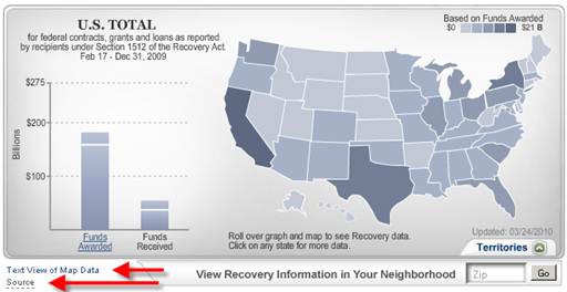
Figure 1: Home Page Map. The home page Flash-based map includes descriptive text that can be read by screen readers but is hidden from view through CSS. Users can also link to the “Text View of Map Data” which is an html-based tabular view of the same data displayed in the Flash Map. Because visualizations are inherently inaccessible, allowing for download of data sets allows users to analyze the data in any manner that they prefer. The “Source” link also has descriptive text that can be read by screen readers out of context as a distinct link label.
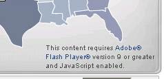
Figure 2: Home Page Map. If the user is missing the required Flash plug-in or has JavaScript disabled, they are provided with a disclaimer and the ability to link to the download page for the Adobe Flash Plug-in. The static image links directly to the “Text View of Map Data” page that displays all the map information in tabular html format.

Figure 3: Home Page Map. The “Text View of Map Data” page that displays all the map information in tabular html format. All Data tables are marked up with Accessible code including proper <th> and scope attributes to associate headers with columns and rows
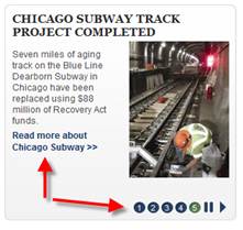
Figure 4: Home page Featured Stories Rotator. The Featured Stories module on the home page rotates through information in a slideshow-like format. The information on all slides is available to screen reader users. The “Read more about Chicago Subway” link and the slide controls are marked with distinct link labels. This enhances non-contextual navigation for screen reader users. Simply using “Read more” is not descriptive enough.
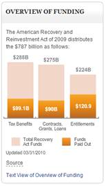

Figure 5: Flash-based charts throughout the site include descriptive text that can be read by screen readers, but is hidden from view with CSS. Users can also link to the “Text View” of the data which is an html based tabular view of the same data displayed in the Flash. The “Source” link also has descriptive text that can be read by screen readers out of context as a distinct link label.
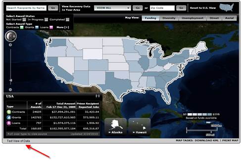
Figure 6: Where Is the Money Going Flash-based ESRI Map. Flash-based map shows geospatial representation of funding, diversity, and unemployment information. If the user is missing the required Flash plug-in or has JavaScript disabled, the user is provided with a disclaimer and the ability to link to the download page for the Adobe Flash Plug-in.
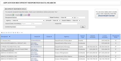
Figure 7: Where Is the Money Going Text View page. The “Text View of Data” page displays all the map information in tabular html format. All data tables are marked up with accessible code including proper <th> and scope attributes to associate headers with columns and rows. Non-Flash or non-JavaScript enabled users have the ability to search the data using the same criteria available within the flash module.
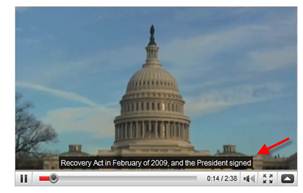
Figure 8: Videos. Flash-based videos provide synchronized closed captioning. If the user is missing the required Flash plug-in or has JavaScript disabled, they are provided with a disclaimer and the ability to link to the download page for the Adobe Flash Plug-in.

Figure 9: Videos. Videos also have text-based transcripts that provide comparable content for those users who prefer the transcripts. If the user is missing the required Flash plug-in or has JavaScript disabled, they are provided with a disclaimer and the ability to link to the download page for the Adobe Flash Plug-in.
V. 508 Compliance Testing Process and Tools
The compliance testing process for Recovery.gov measures accessibility through compliance to the 1998 Section 508 amendment of the Workforce Rehabilitation Act of 1973, 1194.22 Web-based Intranet and Internet Information and Applications and 1194.24 Video or Multimedia Products. This is an ongoing process.
- Accessibility testing started during the conceptual design phase before programming and included a detailed review for potential 508 compliance issues.
- Automated scans and manual accessibility reviews are done quarterly and when new features are added. Watchfire® WebXM™ software (http://www-01.ibm.com/software/rational/welcome/watchfire/products.html) is used to identify instances that fail to meet one or more of the 16 compliance standards, a through p (http://www.section508.gov/index.cfm?FuseAction=Content&ID=12#Web).
- Color schemes that prevent low vision users and colorblind users (protanopia, deutanopia, tritanopia) from easily visualizing content are avoided. Contrast and color schemes are tested using the following emulation tools:
- Fangs (Firefox plug-in for screen reader emulation) is used to assist in identifying potential screen reader issues (https://addons.mozilla.org/en-US/firefox/addon/402/).
- Full screen reader testing using Jaws is done quarterly as part of the accessibility review to check the accuracy and quality of the content and navigation. New features are tested and validated as they are developed. Accessibility techniques, such as providing methods for skipping repetitive navigation, avoiding non-distinct link labels and using markup properly (header tags, alternative text, table headers), are reviewed throughout the site.
- Adobe Portable Document Format (PDF) files are manually reviewed for compliance and also validated against Adobe Acrobat Professional’s Accessibility Report. Users can get information regarding the accessibility of Adobe Portable Document Format (PDF) files from http://www.adobe.com/accessibility.
All reported instances that fail validation are fixed and reviewed again. This process is repeated until no instances are reported.
VI. The Recovery.gov 2.0 launch (9/28/2009)
Attention to detail was critical during all stages of the development and quality assurance process. A system was put in place for bug tracking that prioritized issues based on severity for multiple categories , including functionality, data validation, and accessibility. An iterative process for bug resolution attempted to address all issues prior to launch. However, due to the aggressive time line, several accessibility issues that were identified and recorded within the bug tracker had to be resolved post launch. This initially resulted in some negative feedback from the accessibility community, however, the quick resolution of items within two weeks, resulted in positive community comments.
VII. Ongoing accessibility
Recovery.gov is a dynamic, constantly updated, and evolving website. Maintaining accessibility is always a challenge especially with multiple contributors in a CMS environment. Content providers, editors, and approvers have gone through training to ensure that accessibility is adhered to as the site grows.
The documents posted most frequently to Recovery.gov--and that the two Recovery.gov web managers spend the most time checking for 508 compliance--are the approximately 50 PDFs received monthly from the Offices of Inspectors General. These reports that range from 10 pages to 150 pages are manually reviewed by the Recovery.gov web managers. Using Adobe Acrobat Professional 9.0, the web managers perform two full checks on every PDF:
- Adobe PDF
- Section 508 web-based intranet and internet information and applications (1194.22) checks.
These checks most frequently find alt text, table formatting, and document-language designation problems. If the issues are not too numerous and the document is editable, the Recovery.gov web managers make the changes and re-run the checks. When the document meets 508 compliance, it is published on Recovery.gov.
PDFs that cannot be made 508 compliant by the web managers fall, most frequently, into two categories:
- Data tables with incorrect formatting
- Image documents that have not been properly scanned to make them computer-readable.
Many of the 508 issues are a result of the agencies’ unfamiliarity with how to make a PDF compliant. Frequently the documents will have alt tags that read “pie chart” or “table” instead of the full description.
These documents are returned to the agency with an Adobe-generated accessibility report, explaining the problem(s) found in the document. The agency is asked to correct the file and resubmit for posting. The resubmitted PDFs are again run through the same checks by the web managers to confirm that all Section 508 issues have been resolved.
Occasionally, there is a PDF that cannot be corrected either by Recovery.gov web managers nor the agency. In one case, for example, an agency submitted a scanned document that was computer-readable, but for reasons that the web managers were unable to determine the checks still generated errors stating that pages were scanned as images and required alt tags. In a case such as this, when we know that we have made a good faith effort to correct the problem and we know that the document is, in fact, computer-readable, the document will be posted to Recovery.gov.
To assist the Offices of the Inspectors General in making their reports and findings Section 508 compliant, the Recovery Board arranged for Dr. Jonathan Lazar, from the Department of Computer and Information Sciences, Universal Usability Laboratory, at Towson University, Towson, Maryland, to conduct a training seminar on Section 508 compliance. During the four-hour session, Dr. Lazar addressed the importance of making PDF files 508 compliant and gave step-by-step instructions on how to perform this task, including which tools to use.
In addition, new modules and data-driven interfaces are validated against the development team’s accessibility check list before they are posted to the Quality Assurance environment for review. All validation issues are resolved before posting. The checklist consists of the same guidelines that were used during the initial programming and ongoing maintenance of the site includes:
- Manual review
- Automated scans using Watchfire® WebXM™
- Contrast and color schemes are tested using emulation tools found at the following urls: http://juicystudio.com/services/luminositycontrastratio.php and http://colorfilter.wickline.org/.
- Screen reader testing using Fangs (Firefox plug-in for screen reader emulation) and Jaws
- Adobe Portable Document Format (PDF) files are manually reviewed for compliance and also validated against Adobe Acrobat Professional’s Accessibility Report.
VII. Conclusion
Recovery.gov’s emphasis on accessibility has been both a challenge and a major benefit. As the federal government’s premier site for transparency and open government, it sets a high standard for ensuring that the more than 1.5 million monthly visitors to the site can share in the information and user experience. Testing with individual users and focus groups to supplement automated evaluation is a major design requirement to ensure 508 compliance. Listening to customers and rapidly responding to problems with accessibility is another reason for the site’s success.
Recovery.gov’s elegant but simple style, openness of content, exposure of data, and accessibility have contributed to its award winning design. As of July 2010, Recovery.gov 2.0 has received seven major awards including being recognized by the 14th annual Webby Awards. Newsweek noted the site is “... perhaps the clearest, richest interactive database ever produced by the American bureaucracy.”
