
11.2: Designing mobile applications for multiple form factors
Tom Hume, Johanna Hunt, Devi Lozdan, Bryan Rieger
Description of the app, with images
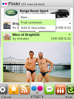
Trutap is a social networking service for 350+ different models of mobile device, which aggregates online blogging, instant messaging and social services like Facebook, allowing its users to interact with these even when away from the PC.
The design of the Trutap application, which took place over two major releases, posed significant challenges in terms of how to integrate disparate sources of data onto small-screen devices, and produce a design which would scale between form factors.
Overview
Trutap was a mobile social networking product, built for a UK startup between 2007 and 2009. The product was designed with a clear goal: teenagers and young adults were spending half of their social lives online, but had to leave that half behind when they walked away from the PC. Trutap would help them keep connected, even when they were away from the PC.We launched two versions of the product: Trutap 1.0 offered its own mechanisms for managing your contacts and communicating with them and tied into a range of existing instant messaging networks (Yahoo!, MSN, AOL etc.). Launch in 2008, this version saw far greater take-up in India and Indonesia than with its original target audience of UK students.
This takeup, combined with the successful launch of the iPhone in July 2008 and the increasing prominence of Facebook as the dominant site for personal social networking, led to a change in emphasis for the 2.0 release of Trutap. Launched a year after 1.0, and technically an evolution rather than a reworking, 2.0 emphasised the aggregation of existing online services, tying into Facebook, weblogging software, photo management and extending the number of instant messaging services covered. Publicly, the product was presented as a means for aspirational middle classes in the developing world to experience many of the same benefits that the iPhone promised, on their conventional mobile devices.
Trutap 1.0 was launched as around 30 separate products targeting individual handset families and generated from a single codebase. This led to ongoing issues around the effort involved in regression-testing the product. Trutap 2.0 was launched as a single binary incorporating 3 different versions of key graphical assets (for small, medium and large screens). This led to an intrinsically consistent interface, a speedier development process and a more robust product.
By 2009 Trutap 2.0 supported well in excess of 300 different devices, all served by a single user interface design, and between them reaching just shy of 400,000 customers. Creating and implementing this design was one of the key challenges of the project; by definition, the product relies on aggregating many sources of information from many different services and brands in a consistent manner, for consumption on a wide range of form factors. In the course of working on the 1.0 version we developed a number of concepts and practices which were successfully applied during 2.0.
Trutap: version 2.0 design concepts
 |
|
|
Multiple services, aggregated vertically |
Carousel for inter-service navigation, |
|
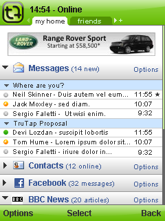
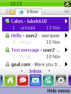
Trutap: version 2.0 screenshots, inbox
 |
|
|
128 x 160 screen size |
176 x 220 screen size |
240 x 320 screen size |
Designing for multiple devices - Designing for 'Fragmentation'
Mobile devices come in a range of form factors. Devices can fundamentally differ in shape, with "candy-bar" or "clam-shell" designs extremely popular, but others (such as the full-keyboard Blackberry-style layout) also prevalent. Screen resolutions vary dramatically, from around 128 pixels wide by 128 pixels high up to 640 by 960 and beyond. Input mechanisms are also wildly different between devices: at one extreme is the iPhone, with a single key; at the other sit devices like the Blackberry, which include a full QWERTY keyboard. Add to these overt differences more subtle variations like the use of different colour palettes, various underlying radio networks, and availability and resolution of cameras.There is some level of standardisation between devices from different vendors, mainly driven by the availability of off-the-shelf component parts; for instance, there are many devices with a screen resolution of 240 pixels wide by 320 pixels high, and many have simple "12 key" keypads.
"fragmentation": to reach a broad audience, a mobile product must work across a wide range of very different devices.
For some products, such as enterprise software targeting a limited base of customers using known hardware, fragmentation is less of an issue. It is particularly problematic when designing consumer-facing products for a wider audience because it is impossible to predict or control what devices end-users will own.
Designers of mobile software products must address fragmentation by considering industry advances, physical constraints, and technological capabilities. At the same time the context in which their product will be used, and interface by which it will be used, are also key considerations: will it be on a factory floor or at the bus stop? Will it in the midday sun or the middle of the night? Will the user control it through voice commands, a touch-screen, or by physical gestures? And so on. Designers extending brands into mobile will also need to ensure that the mobile experience of the brand is congruent with its representation elsewhere, even while fine-grained control over fonts and colour and pixel-perfect consistency may not be feasible.
Summary of Trutap V1
Introduction
The aim of Trutap 1.0 was to produce a full-featured messaging product which would work across a wide range of devices. Trutap had a pre-existing product called Hotxt which had been licensed from a third party, but had decided to redevelop from scratch. The redeveloped product needed to have equivalent features to Hotxt; it needed to have a much improved user interface (something which had been identified as an issue with Hotxt); and it needed to be a suitable platform for future development.Trutap 1.0 was released for around 200 different devices. 32 different builds of the product were required to achieve this coverage, which differed in the screen size and shape they supported; in accommodations they made for different font sizes on different devices; and in including workarounds for handset-specific bugs. One key problem which this number of builds led to was the quantity of effort involved in regression-testing product builds.
Description of Process
The team at Future Platforms (FP) building Trutap had worked together for years previously, had experience delivering mobile products across a range of devices, and were familiar with the issues involved. The team at Trutap were similarly experienced: whilst technically a new team at a new company, many of them had worked together before. During V1, most of the design thinking was carried out by an interaction designer and a visual designer at FP.
We kicked the project off with a workshop drawing together designers and developers from FP with the Product Manager, Chief Technical Officer and Software Architect from Trutap. This workshop clarified the scope of the project and broad feature-set, to the extent that some of the architecture and technical design work could begin. It also gave some early guidance over the desired look and feel.
Our initial approach was to sketch the broad outlines of the product with a style guide, and fill in the detail for specific sections of the application (for instance, contact management, or instant messaging) with more detailed wireframes as we worked to build those sections. Work on the broad outlines included thinking through consistent screen layouts, metaphors employed throughout the interface, and tactics for handling error conditions. We reasoned that this would give Trutap the benefit of a consistent product without a lengthy up-front phase of documentation in which we attempted to settle every detail of the UI.
In retrospect, the style guide worked well as a tool for establishing principles, but the wireframing of individual sections quickly became painfully onerous. Each iteration of designs involved the production of a new document (using Visio) by staff at FP. They would email the document to the Product Manager at Trutap who would review, comment, and pass back. With the benefit of hindsight, the interaction designer who worked on Trutap V1 would have some more on-paper sketching to confirm details of the flow, before crystallising them into a formal document; though the production of some custom templates and stencils for Visio did make the process quicker and easier. Developers would refer to these wireframe documents and the style guidelines as individual sections were worked on.
Instant Messaging (IM) was one area where everyone involved in design and development felt that the product shone. Many of the team ended up as users of the Trutap product purely to use the IM features. Whether this additional attention on the feature led to its improvement, or whether its quality led to its usage, is difficult to determine.
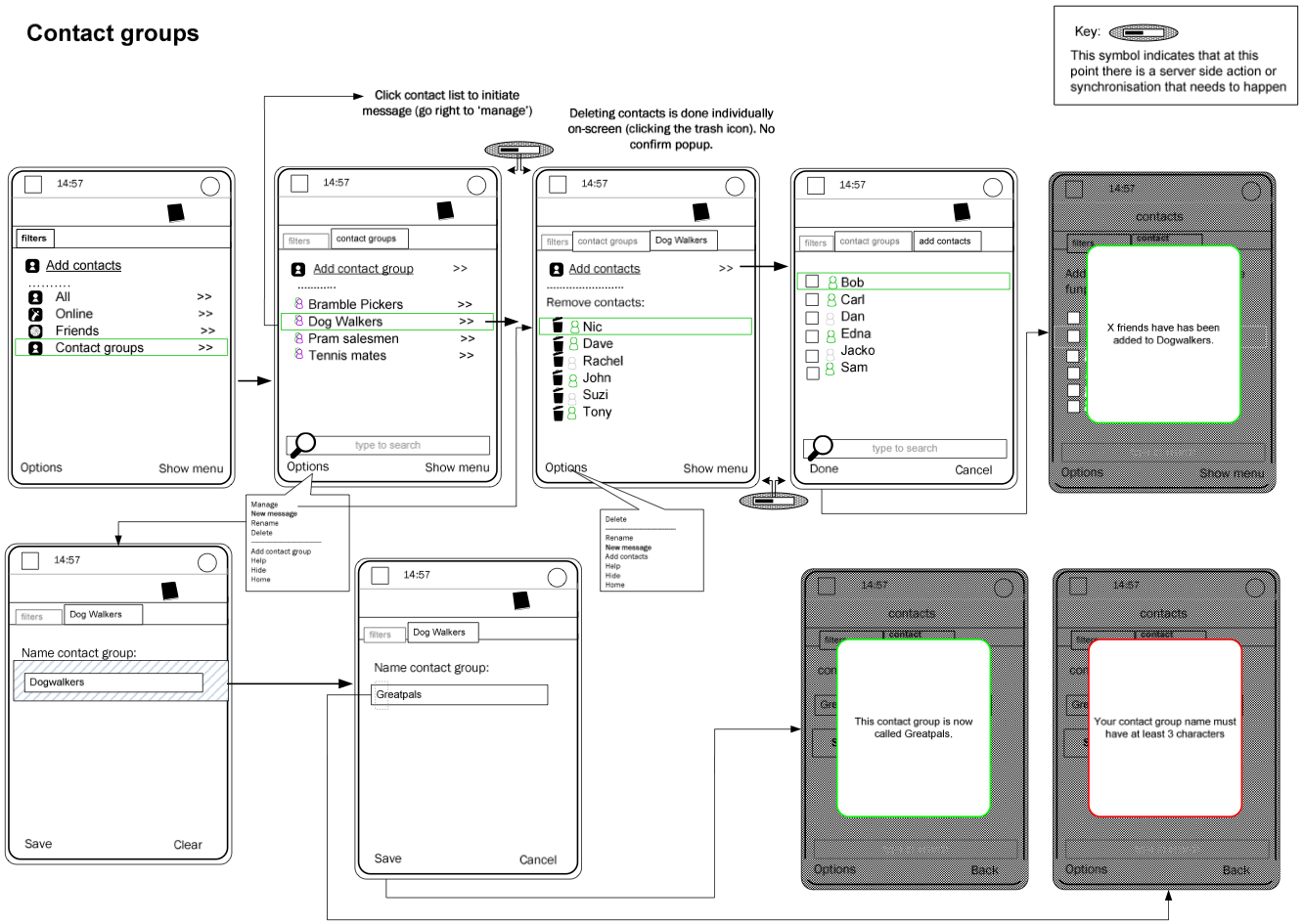
(Sample wireframe for management of contact groups)
Example Design Decisions
Trutap was an app for social communication; as such, we felt it was important to encourage users to run the app as frequently as possible, or at least to avoid dissuading them from doing so. From a technical perspective, this meant that we worked hard to reduce the amount of data being transferred by the application over 3G networks, in order to reduce the drain of precious battery life and the running up of data costs for end-users. From a design perspective, this led us to include the current time on all screens; we reasoned that our users might be using their mobile as their primary timekeeping device, and if they had to exit the application to check the time, they would do so.Even a trivial feature like this led to problems when we tried to implement it across a range of devices. Some handsets overlay an on-screen indicator over the top of running applications when they are downloading data over the network, to alert users that this is happening. The position of this indicator is not consistent; on some Sony Ericsson devices it was in the top right of the screen, for Nokia it was top left. In order to avoid this indicator obscuring the current time, we had Nokia and Sony Ericsson-specific builds of the product display the time in different locations.
Designing for some of the smaller screen sizes was also challenging in and of itself; producing a visually attractive design for 128 pixel by 160 pixel screens without making the whole app seem overly simplistic was a challenge - our design team found adding the "polish" which contributes to an excellent user experience challenging in this environment. We had begun the project by designing for the then-standard 176 pixel by 220 pixel screen size, and a lesson learned in this process was the need to consider other sizes from an early stage, and avoid leaving the "downscaling" work for later on.
The rebrand from Hotxt to Trutap occurred mid-way through the V1 project, after the visual design work on the Hotxt branded version of the product was well underway. This was the first time that design decisions in the project had been driven by new work done outside the team at FP, and many of the team were unhappy with the new Trutap brand. That said, many aspects of it (the name, colour scheme, and logos) had been focus-group tested by Trutap with members of the target audience for V1 (teenagers and students), and had performed well in this testing.
During the development of V1, the growing weight of regression-testing and developing the application in 30 or so builds put great strain on the developers and testers involved. This contributed to a change of approach for V2 of the product.
Post-launch a few device-specific bugs were found and addressed. Little ongoing porting to new devices was carried out, with the exception of a port to the Blackberry, which had a radically different screen size and shape and keyboard layout to any previously targeted device. The Blackberry port was unusually painful, and whilst it launched there was a sense that it could have been a superior product, perhaps if there had been more effort spent on achieving consistency with the rest of the Blackberry UI.
Conclusions
Trutap version 1 was a success as a product. Designed and built from scratch by two teams who'd not previously collaborated, when it launched it gathered a small audience and won some industry acclaim. We were extremely happy with the quality of the Instant Messaging part of the product. Everyone agreed that this was the strongest element of the service so far. In V2 we would keep this part of the product almost unchanged, and Trutap would emphasise it further in their marketing and PR.relationship between FP and Trutap was good throughout. Where there was pain, it was felt in the management of design iterations and the use of wireframe documents to communicate designs between FP and Trutap. The final months of the project were a sadly traditional "crunch time" for the development team, as they took on the task of migrating the product to new devices at the same time as fixing final issues.
The product was launched across a wide range of devices, and gathered customers on all of these devices. Fragmentation issues (like the network activity indicator example mentioned above) reared their head throughout the project. They became particularly marked when the main development ceased and the work to take an initial version of the product to a wider range of devices began. At this stage, unexpected differences between devices and bugs in specific handsets also became visible; for instance, we found that certain Samsung devices failed to implement a small, but crucial, piece of networking software which prevented our communications layer from working correctly, and the app from sending or receiving some content.
The initial workshop worked well as a mechanism for establishing a clear product vision and for having some key (occasionally heated) discussions early on; we have continued to use this approach with similar success on subsequent projects.
Summary of Trutap V2
Introduction
During the production of Trutap V1, Facebook gained significant market-share and the iPhone was announced. Trutap V1 saw little take-up amongst its original audience (UK teenagers and students), but unexpectedly high adoption by an audience located predominately in India and Indonesia. These together changed the direction which Trutap-the-company took: iPhone was a device which allowed access to regular Internet services, but it wouldn't be available to the majority of consumers. Trutap saw an opportunity to turn their product into an "iPhone for the rest of us": a mechanism to allow anyone to aggregate and consume Internet content on-the-move.The goals for V2 therefore centred around providing a superior user experience, and in aggregating large quantities of online content under the Trutap brand. The latter involved a great deal of technical work for the Trutap server-side team, who would need to integrate multiple third party services with the infrastructure they had built during V1. There would be some work for FP to do to provide an interface onto this content, but most of our effort was put into improving the user experience.
Trutap V2 was initially described as a "UI refresh". When we examined the codebase and realised that 70% of the source code was devoted to the user interface, we encouraged stakeholders at FP and Trutap to consider it a rewrite.
Description of Process
Between V1 and V2 the design staff at FP changed: with the original designer who'd worked on V1 leaving and a new design team joining. With the move to version 2, we carved out some time to rethink objectives, and came out with the following list:- All messages are equal: there are lots of ways to communicate (IM, Facebook, Twitter, etc), and they should be treated similarly;
- Integrate 3rd party services: the open web provides a huge range of useful services: bring them into the product instead of trying to replicate them;
- One interface: many services should be accessed in a similar fashion;
- Glanceable update: as a mobile app, the product shouldn't require in-depth attention from its user;
Initial workshops were used to discuss these ideas and identify possible design directions. We spent a month or so sketching out some concepts, examining them and in some cases prototyping - though we noted that prototypes generated less enthusiasm from our customer than more detailed documentation, perhaps as a result of schedule pressure and lack of perceived progress. Another issue with prototyping was that certain tools made certain sorts of prototype straightforward: at one point we found ourselves experimenting with visual effects which were simple to produce in a Flash Lite prototype, but difficult to then incorporate into a Java application. We also found that putting large amounts of effort into a prototype slowed its iteration: there was a tendency to not want to throw away work. The team (which would include Product Managers at Trutap) lacked a shared understanding of tools which could be used for fast iterative prototyping.
Next we moved to executing design feature-by-feature. Creating and implementing this design was one of the key challenges of the project; the four objectives of the design we had to fulfil were individually and collectively ambitious, though in this case study we have concentrated on how cross-device issues impacted on design as opposed to the solving of these objectives.
Between Version 1 and Version 2, FP had adopted an iterative project management process called Scrum and was working in 2-weekly timeboxed iterations for the duration of V2. Feature-sets of the product (contact management; messaging; profile management; and so on) were initially apportioned to specific sprints, with a view to limiting effort spent on each and thus spreading budget in a consciously controlled fashion.
In the course of working on V1 we developed a number of concepts and practices which were successfully applied during V2. In particular we simultaneously adopted two different design approaches for V2: the big picture was drawn out with wireframe documents, created collaboratively by the Product Manager at Trutap with support from our design team and regular reviews from our development team (to double-check that they were feasible, covered edge cases, and didn't fall outside budgetary parameters to implement). At the same time visual and interaction design of individual components was conducted: a combination of wireframes for the "big picture" and components for the detail allowed the development team to stitch together the product without having visuals for every screen specified. We were also able to provide a test harness, an on-phone application which did nothing more than exercise the individual components and allowed the Trutap Product Manager and FP QA team to examine their behaviour in great detail.
The regular rounds of revisions of lengthy wireframe documents became quite painful: in total we received and reviewed 81 revisions of these in a 5-month period. Mid-project we started seeking ways to manage change control better in these documents (such that the development team didn't need to reexamine every screen of every document in the event of a new version being released). We understand that what our team saw was a fraction of the overall revisions produced by the Product Management at Trutap; shielded as we were from much of this, it was nevertheless a burdensome process.
Example Design Decisions
At an early stage, a decision was made to focus on conventional smartphones with numeric keypads, and avoid devices with QWERTY keyboards like the Blackberry. These form factors and devices had proved problematic on V1, and mindful of budgetary constraints we were keen to de-prioritise them for V2. This allowed design to focus on a single form factor (though still with multiple screen sizes).For Trutap V2, the team at FP proposed and sold an approach to screen layout and design which reacted to the device capabilities (as opposed to specifying the exact positioning of on-screen elements in pixels). Specifically, we returned to a technique from the 17th century1, and based the exact spacing, sizing and positioning of components on the size of the "m" character in the native font of the handset. This, combined with a supporting technical approach, allows screens on a wide variety of handsets to lay themselves out according to simple rules: what we lose in pixel-perfect control, we gain in having a design which fundamentally takes care of the issue of scaling to different screen sizes and shapes.
Over and above this approach, we realised that the information density of smaller screens would need to be higher. To that end we cut out certain visual elements when transitioning the design to a smaller screen size. This was done programmatically, such that a single binary of the product might detect the device it was running on and react accordingly.
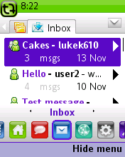
| |
|
|
128 x 160 screen size |
176 x 220 screen size |
240 x 320 screen size |
The iPhone launched between V1 and V2 of the product, and correspondingly customer expectations of mobile UI had shot up. This, combined with a desire to provide a better experience of small-screen devices, led us to use animation for two purposes:
- Supporting users in building a mental model of the application by using sliding transitions between screens: as the user navigates down into detail, screens slid in from the right and were "stacked up" into a display of on-screen tabs, giving a sense of how deep they were into the product and what section they sat in.
- Allowing more information to be displayed within elements that currently had focus. So, for instance, if in a contact list the currently highlighted item was a user who had a long status message associated with them, after a second of highlighting this status message would start to animate ticker-tape style - allowing it to be read without moving to a separate screen.
The use of animation was also driven by internal work we had carried out on Cactus, a user interface library we developed and used internally, allowing it to be easily extended for this purpose.
Conclusions
Moving the customer away from a pixel-perfect mindset when approaching visual design allowed us to deliver the product faster, and better. Much of this was driven by the development team, which would not traditionally be a recommended approach for application design.Attempts to port the UI to a range of touch-screen devices launched by LG and Samsung towards the end of the project were generally unsatisfactory. Whilst the product technically worked, we felt that the UI should be once again revisited from first principles to take advantage of the touch-screen.
One feature-set was moved wholesale from V1 to V2 with very minor changes: instant messaging. This was somewhere where FP and Trutap both felt the original product was particularly strong and didn't require modification. We also observed that the development team were themselves using the IM aspect of the product, more than any other: voluntary "dog-fooding"2 of this kind is something we would look out for in future.
The response from end-users to the product was anecdotally positive (though Trutap ran out of funding and went into hibernation before formal studies could be carried out). Trutap themselves were happy with the product, which was rolled out to around 350 different handsets across 3 primary form factors (small, medium and large), reaching just shy of 400,000 customers by 2009.
Take Away Points to Remember
- Designing for multiple form factors is in itself a significant challenge: we spent a great deal of time and effort (in design and development) solving this problem;
- Radically different form factors need radically different UI: it proved hard to migrate a conventional smartphone design to touch-screen and full-QWERTY devices;
- Physical constraints, industry advances (both those in ones own sector and adjacent ones: witness the effect Facebook and iPhone had on Trutap) and technological capabilities must all be considered;
- Client/supplier relationships can have a significant effect on design solutions: selling the font-based layout approach worked well. Using prototypes to articulate design solutions didn't;
- "The ancients stole our best ideas", wrote Mark Twain. Inspiration can come from centuries back, as with the font-based layout approach.
notes