|
Matt Davies
Introduction
There is much competition in the mobile telecoms industry. Mobile devices are increasingly feature-rich - they include mega-pixel cameras, music players, media galleries and downloaded applications. This requires the mobile user experience (UE) designer to explore and structure complex interaction design solutions. Designers need to achieve this while retaining clarity and usability for the customer. Paper prototyping offers a rapid design method that addresses these issues, enabling the designer to work through every detail of the user experience early on.
Typically, mobile phone UE design projects involve multiple disciplines. Team members may be software engineers, marketing managers, network specialists or business managers. All of these ‘stakeholders’ have their own viewpoint on what a product should be and how it should function. Each stakeholder has needs and requirements that should to be considered in a design solution. The stakeholder may include clients, internal people and/or a mixture of both. Paper prototyping provides a tool for everyone involved to be part of the design process. It enables collaboration and consideration of a design solution from multiple perspectives.
Structure of document
- Part 1: Problem Space
Outlines the design constraints faced by designers and how paper prototyping helps.
- Part 2: Project walkthrough
Illustrates the design approach by walking through the design process for a ‘Manchester United’ custom mobile user interface.
- Part 3: Design exercise
Suggests design exercises and a process that enable experimentation with the paper prototyping method.
|
About the author
Matt Davies has specialised in user interface design for over 11 years. He combines an interaction design and visual design approach. He currently works in a global User Experience Group at Qualcomm in the UK. He has focussed on mobile UI design for over 4 years, working with clients worldwide providing user-centred design across project lifecycles. As well as designing, Matt has spent around 700 hours running usability lab studies with users. This experience has provided a deep understanding of user behaviour, which he feeds into his design approach. Matt has also spent time in academic research with cognitive and educational psychologists at Sussex University UK.
Part 1: Problem Space
This section outlines the design issues that mobile UE designers typically face and how paper prototyping helps solve them.
The design challenges for mobile UI projects typically are the issues of time, device constraints and the diverse teams involved in projects.
As designers, how can we design the best user experience in the fastest time possible? How can we achieve this while working within constraints of a small device and achieve the objectives of all stakeholders involved? Designers need rapid methods with which to collaborate, prototype, evaluate and iterate their designs.
The following section covers the core design issues mobile UI designers face and explains how paper prototyping helps work through them.
Design Issue 1:
Device Constraints
The constraints of mobile devices make them a challenging platform to design for. The constraints include limited input controls (keys, keypad) and small screen size. Also, devices by different manufacturers or with different navigation approaches have varying configurations. Often a service needs to be designed for multiple devices and that adds complexity for designers.
When designing for the PC-based product, designers have the flexibility of a large screen area, and ‘point and click’ input using the mouse. Whereas for mobile, there is no ‘point and click’, text entry is slow using the mobile phone keypad, and the screen display size means that the presentation of information is more challenging. A simple example would be if a designer created a search function for a mobile phone. The design process would immediately involve more constraints than if designed for a PC. First, text entry constraints - typing search keywords will be slower, requiring more user effort and more design consideration. Second, the search-results screen creates challenges to the designer. How can a long list of items with many words be effectively displayed on a small screen?
These challenges require mobile UI designers to work through the entire user experience and flow. They need to consider the use of softkeys, menus, sub-menus, use of hardkeys, time taken for processes to complete, menu information architecture, payment issues and other issues.
How does paper prototyping help?
Paper prototyping as a process is rapid and iterative so that issues can be explored from many angles quicker than other methods. Mapping the entire UI enables the designer to consider the overall flow as well as the details of the menus, sub-menus, keys usage and other issues. In the case where the product/service is being designed for multiple devices (with different navigation), the method can include creation of a set of paper prototypes for each device.
Design Issue 2:
Time to Market
The mobile industry moves fast. There is a culture within the industry that ‘we need this yesterday’ or ‘we need to get this into the market before anyone else’. Design methods in the industry often need to be rapid if they are to respond to this. The challenge is in achieving design solutions rapidly, while retaining innovation and clarity.
How does paper prototyping help?
To a business, the time of their designers and developers is a high cost. Paper prototyping saves time at the start of a project. It enables iterations and discussion to be completed before designers or developers start their time consuming work of creating visual designs or writing code.
This saves huge amounts of time and money as the ‘right’ product is developed from the start. The designer and developer can then work to create their visual designs and code based on the paper prototype design.
As part of the paper prototyping work, UE designers work centrally with the team, identifying potential user experience/usability issues from the start of a project. This also saves time and cost longer term as any UE issues are captured before the time-consuming design/development work starts.
Design Issue 3:
Multiple Stakeholders
Mobile UI design projects often involve large, multi-disciplinary teams. This is a major challenge for UE designers. How can designers get all stakeholders to be ‘on the same page’, with their ideas combined and synchronised. The stakeholders often will include software engineers, project managers, marketing managers, commercial managers, handset manufacturers, network operator specialists, visual designers and content managers.
Each stakeholder has a varied skillset, background, ‘discipline language’, requirements and motivations. For example, the marketing person may want to generate profit through “cool new revenue generating services”, while the software engineer is concerned that “the new concepts will be difficult to implement in the timescales”. While on the other hand, the handset manufacturer might see limitations of their target device in providing that service – while the UE designer is focussed on the complete product experience, from the customer perspective.
How does paper prototyping help?
Paper prototyping provides a powerful way to collaborate. It enables all stakeholders to work on a single view of the product user experience, as a group. The method enables everyone in the team to discuss their design ideas - comparing designs, throwing out designs, iterating designs, until the optimum design is reached.
A key strength comes from the simplicity of the materials used in design sessions. The use of just pens and paper to draw the user experience enables all stakeholders to be involved, regardless of their skillset or discipline. Anyone can sketch their ideas to explain them, so there is no division of the group based on skillsets. For example, each stakeholder has tools that are specific to their role. The visual designer uses Photoshop, the developer writes C++ code and the marketing person who creates PowerPoint documents. None of them use all of these tools. So, using pen and paper provides a common tool and a method to communicate ideas across disciplines.
Another issue is that stakeholders tend to become more attached to ideas and products the more developed they become. For example, a developer who has written code for a feature has invested their time and effort into that feature. Even if the feature creates a negative experience for a user, the developer may want to keep it in the product. A visual designer who has spent time creating detailed visual concepts using Photoshop may be attached to those designs to some extent. The power of paper prototyping is that everyone feels more comfortable throwing an idea out early. This ‘fluid’ design approach leads to more refined design solutions at the end of the design cycle. It also leads to designs that are more centred on the user when a UE designer works with the team as they can always address the user perspective in sessions.
Design Issue 4:
Proving Concepts Early
Designers often need to create ‘proof of concept’ prototypes. This is enables them to get ‘buy in’ from stakeholders and others who will invest, or promote the concepts. In the mobile industry, many of the concepts are new and may not have reached the public domain yet. So designers need to provide concrete examples of how the design will work and how it will look. The most effective way is through prototyping – both paper prototypes, and higher-fidelity prototypes, based on real devices. Once a prototype exists, all stakeholders have the method with which to understand the concept more clearly. That by default enables more productive discussions and further ideas. Viewing a prototype also helps to define the direction clearly for all involved.
How does paper prototyping help?
Using paper prototyping is the fastest possible way to design, iterate and discuss concepts as a group. Once a paper prototype has been created, there is a solid prototype – even though it is in sketch form – that can be discussed and which brings the concept to life for the viewer regardless of their discipline.
Design Issue 5:
Technology-led, not User-Centred
Until recently, the mobile industry has often created products with a ‘technology first’ approach. This has meant products being created by engineers and technologists rather than user experience designers or usability experts. Often they are highly technical people, who focus on the technical perspective and have less awareness of actual end user needs and behaviours. (Note: At the time of writing, the situation is changing, as the industry matures and mobile products and services being made more user-centred.)
How does paper prototyping help?
Paper prototyping enables a ‘user first’ approach. It enables the UE designer to model and craft the user experience – the complete interface as it will unfold to the user. Paper prototyping facilitates and promotes the design of the user experience and interface before any software engineering commences. As a result, the design is centred on the user and their product experience – rather than being led by the technology.
Part 2: Project Walkthrough
Design of a ‘Manchester United Fan’ mobile phone UI
This example project provides a walkthrough of various issues considered when designing a mobile phone UI. The example covers a relatively small mobile phone application for the purpose of illustrating the method in use. By contrast, designing complete mobile phone applications such as ‘contacts’ or ‘messaging’ would be a much more involved process.
The Design Scenario
Imagine we are asked to design a ‘rich content experience’ for a mobile telecoms operator company. They want to target their customers’ personal interests, and provide them with downloadable ‘themes’. The operator wants to encourage customers to utilise online services - like downloading wallpaper images, and checking online information. The idea is that ‘themes’ will change the way the customers’ phone looks onscreen as well as provide new content features.
The example for this scenario is a ‘Manchester United’ football team theme, targeting fans of the team. The theme could equally be for a music artist, a blockbuster film, a celebrity figure and so on.
1. User Focus: Identify user goals
A first step in the design process would be identifying the key user goals that the service is to support. The user goals provide a design reference point throughout the paper prototyping work. Some example user goals would include:
- Checking the latest wallpapers that could be downloaded
- Downloading the chosen wallpaper
- Changing the wallpaper setting of the phone to the new downloaded wallpaper
- Checking the team news headlines
- Checking an individual news story
- Checking the team’s upcoming fixtures
- Checking the team’s position and scores in the league table
2. Content audit/structure: Identify features and content
As well as considering user goals, we need to detail the content and features of the product. This includes identifying the content available, the desired features and the overall user experience the operator wants to achieve. For this project, some of the areas to consider would be:
Operator company (client focussed) aims to:
- Enable personalisation
- Encourage customer usage of online content
Content and features
- Manchester United wallpaper images
- Manchester United fixtures information
- Manchester United news stories
- Manchester United league tables updates
User Experience considerations (users focussed)
- The download and purchase process
- The installation process for the theme
- The switching between multiple themes
- The navigation of the theme and its contents
Our aim would be for the design solution to meet the needs of both the client and the target user. This early stage in the design process would involve a period of brainstorming, where we consider all possible content and features individually, as well as how they would work together as a complete product.
3. First Paper Prototype: First Design Iteration
Once the user goals, content and features are mapped out, the first paper prototype can be created. The images in the following sections illustrate the paper prototypes and how they are used for different design decisions.
3.1. Macro vs. Micro views
Looking at the two images here (Figure 1) you can see that paper prototyping enables us to view the application we are designing at both a ‘macro’ and a ‘micro’ level. The macro view is where we take the entire application and view it in one. The micro view is where we ‘zoom’ into the details of particular application sections. In this image, we consider the details of which options appear to the user when they select ‘Options’ at that particular screen.
As we design, we switch between these two views constantly. A key benefit of the zooming is that it enables us to see that a service or application uses words, options, layouts and other elements consistently. Consistency is as important with mobile UI design as with any other user interface, so comparing the two views helps address this factor in a design.
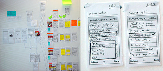 Figure 1 Micro and Macro views with paper prototyping Figure 1 Micro and Macro views with paper prototyping
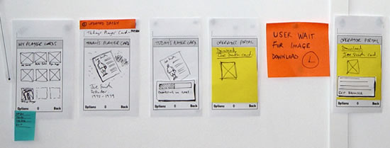 Figure 2 Screen by screen flows Figure 2 Screen by screen flows
3.2. Screen-by-screen flows
We work to map out every individual screen, state and view the user will see on the final device UI. So here (Figure 2) for example, we have started at the point where the user chooses a ‘player card’ – one of the features of the application. They view a preview full-screen, they download it, link to a WAP browser screen, wait for the download process and get their card. It is important to capture every stage and state, as the paper prototype is our model of the user experience in fine detail.
3.3. Sections and contents
The sections of the application are drawn out in detail (Figure 3). This enables us to start exploring the content. For example, what would users expect when they view the wallpapers for their team? Do they want to see 20 on the screen at once or just 9? What design issues does that raise based on the visual design, the interaction, the marketing viewpoint and the network operator viewpoint? Every design decision needs to accommodate some of the varied stakeholders requirements.
3.4. Design alternatives
A key strength of paper prototyping is the ability to compare design alternatives (Figure 4). Here the example shows how we considered two designs for the Options menu items that would be displayed. Paper prototyping enabled us to compare the two designs, and view them side-by-side, within the context of the entire application. We could then remove the less effective design once a decision was made on which to pursue.
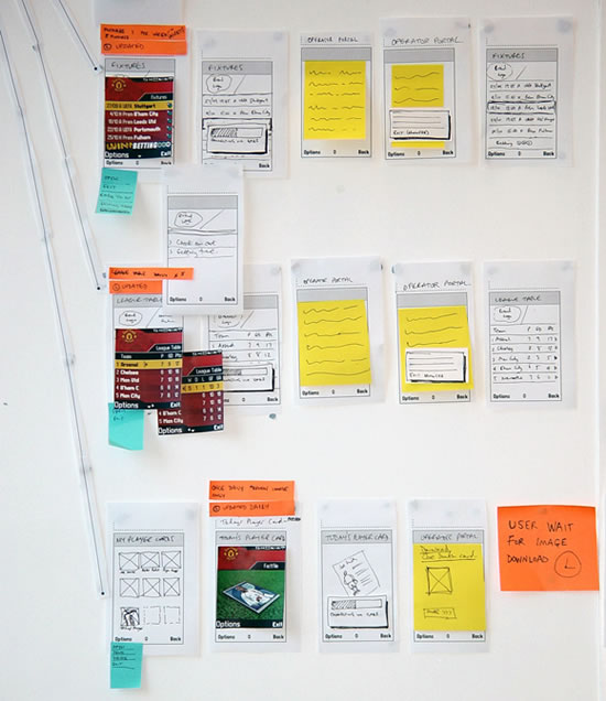
Figure 3 Sections and contents
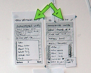
Figure 4 Design alternatives
3.5. Mobile phone network issues
Mobile phone network issues (download processes, lost connections, etc.) are often more difficult to consider at the stage of paper prototyping. Network behaviour can be less predictable than we as designers would like. We aim to achieve the best user experiences while being told by network specialists that they cannot guarantee coverage, the speed of downloading and so on. It is important for us to consider the effect network issues will have on the overall user experience for customers at this early stage of design.
For example, the user is browsing a rich, graphical UI and looking at the Manchester United wallpapers on offer. What effect does the connection and download process of their selected wallpaper have on their overall experience with the product? Does the user have to wait for a connection to be made? Then do they have to wait long for the download? How long does each stage take? What impact does their combined duration have? Do we need to prompt users about what is happening or does it happen quickly? Can we predict approximately how long it will take or is this variable? Do we need to design various options for each situation?
This is a good example of where the network stakeholder, the client and the UE designer might interact with each other and discuss this. So how would each work here?
- Network person – would understand the technical issues of network latency and possible complications
- Client – would care about both the network, cost to operator and the user experience and how to make the business model work
- UE designer – would work as always, as the ‘UE diplomat’ between both what users need and what client wants
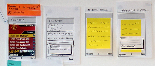
Figure 5 Network issues
3.6. User wait times / User feedback
If we need the user to do something, or wait for a process to complete, we need to provide clear onscreen feedback and dialogs so that we manage the users expectations. We need to map out any significant user wait times, consider how to provide feedback, and the wording to use so that the user experience is as smooth and consistent as possible.
3.7. Navigation consistency
Mapping out the entire application enables us to design navigation models that are consistent, across the application. This means the UI will be consistent in appearance, wording and behaviour regardless of section, content area, etc. Generally, the navigation issues for a mobile application will include:
- Labels and words - used in menus and onscreen throughout.
- Hard keys - on the keypad that are used to navigate.
- Soft keys - map to the onscreen word labels via the two hard keys left and right.
- Options Menus - most mobile phone UI’s offer the user a set of options, accessed at each screen and relevant to the context of that screen. This is an important element that we consider in paper prototyping. We use the approach to make sure that the wording, positions in the item list and other factors are consistent across all Options menus within the application UI.
- Use of a ‘Back’ key – this can either be onscreen as a softkey or a hard key on the keypad. It is one of the most important navigation issues for users ‘how do I get back a screen?’
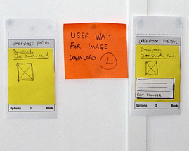
Figure 6 User wait times and feedback
3.8. Visual design treatments
Paper prototyping is a visual process. The screens and their elements are drawn, rather than described using text. So very early on, designers can consider the visual elements of the user interface.
Here in the Manchester United example we can see how visual designers have created initial screen designs. Created quickly, they can add another level of detail to the paper prototypes and bring realism to the concept during the design process. Design considerations such as typeface, font size, screen size and pixel measurements can be addressed here. Screen size is a major constraint in designing for mobile applications, so using screen visuals that are ‘pixel perfect’ can be useful - for example, in considering whether proposed ‘Club news’ headlines will fit on the screen, or if they will need to be truncated. This in itself could have an effect on the overall user experience by affecting readability and access to the headlines information if truncated.
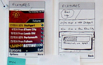
Figure 7 Visual design treatments
Part 3: Design Exercise
Experimenting with the method is the most effective way to start exploring it. With that in mind, the following section offers design exercises and outlines a design process for creating a mobile UI paper prototype.
Exercise ideas
Possible ideas to explore for your concept mobile applications are:
- A theme that includes content focussed on your favourite sport team, music artist, film, city, etc.
- A new downloadable city guide to where you live, aimed at tourists
- A new service aimed at commuters who have long journeys
- A new mobile phone device for elderly people
Materials
The materials needed for the exercise are simple – pens, paper and a room. You can either arrange the pages on a desk or fix them to a wall.
Design process
The stages below are the most effective ways to work through the design concept development. The stages are for guidance and you can spend as much time on each of them as you feel is appropriate for your project:
- 1. Brainstorm contents and concept – for example, for the commuter application you might want to think about their context, their needs, the time they have available, their environment and so on.
- 2. List features to include – list out all of the features and content you want to make available in the product. For example, the commuter application might include train times information but also games to play when bored on the train journey. This list should include all of the features you want to consider as you design them into your paper prototype.
- 3. List user goals to achieve – list out the key user goals for the product you are designing, and use this as a reference point throughout your design work. For example, the commuter might have the following goals as a user: 1) check train arrival time, 2) call home, 3) check news headlines, 4) play a game. Once you have established the goals, you can focus your design on enabling the user to achieve them. You can also consider the frequency of use – so would they want to achieve one goal more/less often than another?
Once you have done some brainstorming and initial organising of your features and user goals you are ready to design…
- 4. Start first version of prototype:
Start by sketching out screens in the order they will appear to the user of your product. As you design, consider the features you are designing, how the user will access them, how they will support their goals, how often they will use each, and so on. It makes sense to spend time sketching, discussing, iterating your ideas until you are comfortable with the design decisions and the shape your product is taking.
- 5. Test your first paper prototype design:
Test this with users – you don’t need a usability lab, just lay out the prototype on a table or stick it to the wall. Then get friends or colleagues who were not involved with your design phase to review it. See how they interact with the design compared to you, see what questions they have, which parts they like and dislike, ask them how they would achieve the user goals you set out at the start.
- 6. Iterate your design to create a second paper prototype design:
Iterate your design based on the findings of your user test. If the feedback was that it was hard to find out the train times, react to that, and reconsider the design of that feature. It makes sense to do this while keeping in mind the rest of the application/sections and how it all fits.
- 7. Test your second paper prototype design:
Run a second user test with a new set of people. How does the solution compare to the last time? Did your iterations improve the user experience?
|
