 |
Overview
This case study focuses on the visual design
of a context-sensitive advert for the Web. It is one output
from a participant observation study of a company that produces
such adverts. The approach to development they use is different
to any described in our book; they use eXtreme Programming
(XP), one of a number of 'agile' methods that are gaining
popularity among some software developers.
After a brief introduction to the company,
Connextra, and XP, we describe the visual design and development
of one context-sensitive advert. We end by summarising the
design issues raised by the case study, and offering some
observations of the XP approach to development.
Background
Connextra (www.connextra.com)
is a web development company that specialises in bringing
contextually-relevant information to the user's desktop. They
use the eXtreme Programming (XP) approach to development,
which is one example of a set of methods, called 'agile' methods.
These methods challenge many of the principles underlying
traditional software engineering lifecycle models and take
a code-centric, people-oriented approach. Connextra has developed
a number of technologies that analyse the content of what
the user is browsing, and then use that knowledge to display
relevant information. One such technology is the ActiveAd.
This case study focuses on the visual design of an ActiveAd.
ActiveAd
An ActiveAd analyses the content of a webpage
and identifies some key terms. These are then translated into
parameters that define the advert to be shown. For example,
an article on careful parenting may discuss the advantages
and disadvantages of different buggy designs. An advert to
be displayed on this page would highlight the sale of buggies
and related equipment. If the article is later replaced by
one about car safety seats, then the advert would automatically
change accordingly. ActiveAds are 'clickable' and can link
through to any webpage specified by the client. For example,
an advert for a bookmakers (i.e. someone who takes bets on
horses etc.) might link through directly to the online betting
slip on the client's site; the buggy advert above may link
to an online catalog showing different models and their price.
ActiveAds work from a feed of data sent by
the client, they parse the data to pick out the information
that is required, and display the relevant advert on the target
webpage. The information in the feed is updated periodically,
e.g. every 15 minutes, and the advert will change accordingly.
The frequency of the change depends on the nature of the information
to go in the advert.
If an ActiveAd cannot be displayed for some
reason, e.g., Connextra's server experiences connection problems,
then the host website needs to know what to display in its
place. It clearly is not desirable for an error message to
appear on the screen. So, each ActiveAd is associated with
a 'panic', i.e., a default graphic that will be displayed
if ActiveAd is not available.
eXtreme Programming
eXtreme Programming is a new approach to software
development which takes a code-centric view of the activity.
There is a lot to say about XP, but this section is confined
to a brief introduction. Further information can be obtained
from the references listed at the end of this case study,
or from our other online resources.
XP is different from traditional approaches in many ways:
- XP involves short, tight iterations of
building and releasing software. In our case study company
these iterations were 3 weeks long, but others have used
2 weeks. At the end of this time something new has been
released.
- Requirements are gathered in terms of
'stories'. These usually begin with 'I want…' or
'We want…'. These are produced by the customer or
client. The developers look at the stories and estimate
how long they think it will take to satisfy them. Developers
and customers negotiate what requirements can be delivered
in the time available. This exposes the customer to developers'
estimates, and encourages them to prioritise their requirements
since it is not possible to do everything in one iteration.
The activity of estimating and prioritising to see what
can be done in the next iteration is called the planning
game.
- The customer is on site and is part
of the development team.
4. Once the iteration has started, developers work in
pairs. No development is done by a single individual.
All development is jointly owned. This is a surprisingly
successful element of XP. Further information on this
aspect is in Williams et al (2000).
- A 'test-first' philosophy prevails. In
XP you write the test to show that the code will work
before you write the code. Testing and coding are performed
together. Before any new software is released, the whole
test suite is run to ensure that it does not break any
other component of the system.
- Some principles underlying the people
aspects of XP are: work no more than 40 hours a week,
be courageous, take responsibility and share ownership.
- Some principles underlying code production
are: keep it simple, have one shared metaphor to guide
system development, regularly restructure the system to
improve it (refactoring), continuously integrate and test,
and follow coding standards.
The Betabet
case study
This case study focuses on the (re-)design
of an ActiveAd for one of Connextra's existing clients, Betabet.
Betabet run a portal website which allows punters to place
bets
with independent bookmakers via the Internet. The advert developed
by Connextra displays the betting odds for the outcomes of
various sporting fixtures such as football games and horse
racing. The specific odds to be displayed are determined by
the contents of the rest of the user's webpage. The advert
is designed to sit on host websites (e.g.www.4thegame.com)
and link directly to Betabet's site.
Here, we focus on the work of the graphic
designer, Elena, who designed the visual appearance and produced
the working html. Behind the visual appearance is Java code
which processes the data feed, handles the website content
analysis, and provides the other infrastructure necessary
for the ActiveAd to keep running.
As in all development at Connextra, Elena
works in a pair with a colleague, although as the only graphic
designer in the team, she is the main driver for most
graphics work. What follows is a description of the work as
observed by the participant observer.
Early design
The starting point for this design, as for
all work conducted at Connextra, is the story, as described
above. This was raised by the client via one of Connextra's
sales representatives, Scott. The story in this case was very
simple:
"We want an improved design for Betabet"
Connextra had previously produced an ActiveAd
for Betabet, but the design needed improving. On clarifying
the story with Scott, Elena discovered that the advert should
show the winnings for a £10 bet, based on the odds displayed.
In addition, the size of the advert was to be increased to
120x120 (pixels), and the client wanted more of the advert
to be clickable.
The first stage of the design was to develop
some sketches, capturing both detailed decisions such as the
size of the columns and rows, and broader issues such as what
the banner across the top should contain. These mockups were
discussed with Scott, and refined.
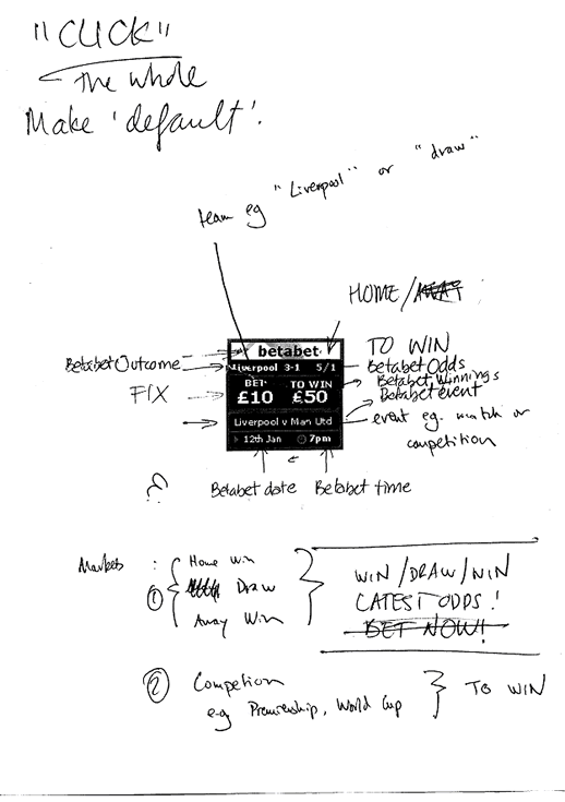
Figures 1 and 2 show these preliminary sketches.
Figure 1 shows some initial ideas for the banner to go at
the top of the advert, and the Betabet panic. The three boxes
on the left hand side are banner lines that will be animated
and displayed alternately; on the right is the Betabet panic
(the 'blob' over 'BET' represents a sketch of the Betabet
logo).

Figure 1: Ideas for Betabet banner and panic
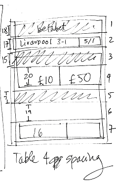
Figure 2 shows some detail for
the main advert. You can see the rows and their contents,
and also where Elena has worked out the height of each one
(the overall height must be exactly 120). The sketched advert
shows the case where the outcome 'Liverpool wins by 3-1' is
given the odds of 5 to 1. This translates a £10 bet
into £50 winnings.

Figure 2: Detailed planning for the main advert
Photoshop mockup
A Photoshop mockup based on these
initial ideas was produced. This allowed Elena to experiment
with colors, typefaces, sizes, positioning etc from a purely
visual perspective, before getting involved in using style
sheets or html. Although Photoshop does not produce exactly
the same look and feel as html, it is sufficiently accurate
for her to get more detailed feedback from Scott. Figure 3
shows a printout of this mockup together with some evaluation
notes.

Figure 3: The Photoshop mockup and accompanying notes from
evaluation discussions
Creating
the advert
Once Elena was happy with the
mock-up, she set about designing the executable version. Some
elements of the advert are animated, i.e., move or change
over time, such as the banner shown in Figure 2, and the names
of the teams and their odds. But some elements remain static.
These static elements were developed first and the animated
elements were superimposed on top of the background at a later
stage.
The background itself was made
up of a series of layers. The first was the black background.
Then came the other colored sections, and the animated banner
across the top. Superimposed on this was an 'invisible' table
structure to hold the other elements of the design. As you
can see from the background, the spaces to display the animated
features of the advert are of different sizes. It would have
been possible to design one table to fit over the background,
with different sized columns for each row, but this kind of
structure in which table cells are 'spanned', or merged to
make larger cells can cause problems in some browsers. Instead,
each element was defined individually.
Figure 4 shows the complete background
for the Betabet advert. The dimensions were based on the original
sketch that Elena produced early on, but the process of choosing
colors and exact sizing went through a number of iterations
before the final decisions were made.

Figure 4: Static background
for Betabet ActiveAd
As a first step towards testing
the advert, without linking to the live data feed, some values
for the teams and their odds entered directly into the html.
This final advert is shown in figure 5, and the panic is shown
in Figure 6.

Figure 5: The final ActiveAd,
containing some dummy data

Figure 6: The 'panic', i.e.
default display, for the Betabet ActiveAd
Testing
against a 'real' webpage
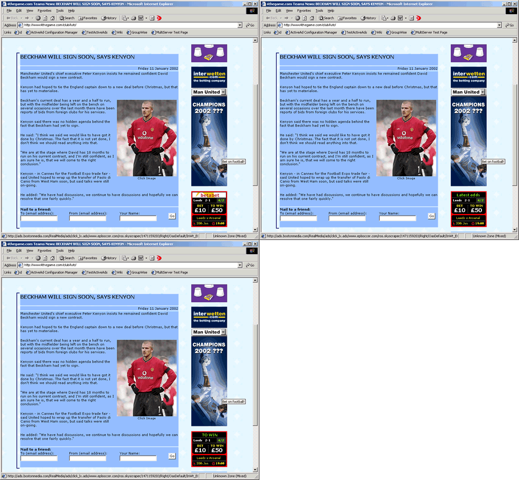
Having produced the correct html,
Elena wanted to check that the proposed advert would look
good on a sample page. Looking at a relatively small image
like this out of context is different from seeing it pasted
onto a real page. To do this, she chose a webpage that contained
Betabet's existing advert, took a copy of it offline, and
pasted in her new design. The result is in Figure 7. Note
that the context-sensitivity feature of ActiveAd is not being
shown here, i.e., the article talks about Manchester United
although the advert displays prices for Leeds and Arsenal.
This is because at this stage the details are hard-coded and
the webpage was taken offline.

Figure 7: A mockup of how the
advert will look against a real webpage
Testing on different platforms
Further testing stages were undertaken before it was linked
to the live feed, including running the advert on a series
of different platforms, and using different browsers. One
change had to be made as a result of this testing. The original
design used the Verdana typeface, but when the advert was
displayed on a Mac, the text was too large and expanded beyond
the boundaries of the design. When the typeface was changed
to Arial, however, this problem disappeared.
Further
and ongoing testing
The next stage of testing (not
observed on this occasion) is to move the advert to a test
server which uses the live data feed, but is not publicly
accessible. This is visible to the client Betabet who can
give the final approval for it to go live. Before this can
happen, however, there needs to be some liaison with those
working on the Java code to ensure that the processing of
the data feed is compatible with the display requirements
of the advert, e.g., that the date arrives in the correct
format.
Once the advert is live, further testing is performed to determine
the advert's effectiveness, i.e., how many 'click-through's
to Betabet's own site does it result in. These statistics
are collected and monitored on an ongoing basis.
Some conclusions and observations
Design
issues
Although quite a small endeavour,
this case study raises a number of interesting design issues,
which we summarise below:
- The need to include a 'panic' gif in
case the main advert can't be displayed.
- The need for careful planning of the
row sizes to make the overall advert just the right size;
the height of rows needs to be specified in pixels.
- The choice of typeface is significant
to ensure that the advert is viewable on different platforms
and using different browsers. Sans serif typefaces (e.g.,
Arial) are more appropriate than serif typefaces (e.g.,
Times) for reading material on a screen. Elena prefers
to use Verdana or Tahoma, but not everyone has Tahoma.
If it proves necessary, as it did in this case, she will
switch to Arial.
- When considering the detailed mock-up,
Elena needed to check that the likely values for the 'live'
data would fit in the space she had provided. For example,
the Betabet advert includes the date and time of the event
to be bet upon. Displaying a date as 12 January requires
more space than 12 Jan or 12/01; a time could be displayed
in the 24-hour clock style, such as 19.30, or as 7.30pm.
In addition to fitting in the space,
the format for display also had to be consistent with
the data format as supplied from the underlying Java code.
- What elements of the design should be
made clickable? What elements is it possible to make clickable?
How do you balance these two?
- The need to take into account different
platforms, and to test on different platforms. In Connextra,
this testing stage was automated, i.e., no-one had to
sit and manually try the advert on each platform.
- The use of mock-ups both for communication
with the client, and for Elena herself to try out alternatives.
Using
XP
The following observations are
drawn from the participant observer study:
- XP in Connextra works well. We cannot
comment on how well it would work in a different organisation
or with a larger software effort. The articles in IEEE
Software mentioned below will give some insights here.
- Working in pairs can cause some problems
for client support. For example, if a client needs a swift
response to a problem or query, it is not possible to
interrupt just one developer, a pair must be disturbed,
and this can result in one developer sitting idly while
the other addresses the support issue. This has knock-on
effects for the iteration time planning.
- Working in a pair all the time can become
claustrophobic. To stop developers becoming bored, each
developer at Connextra is allowed two 'gold cards' a month.
These are days when he or she can work on something on
their own.
- The graphic designer, Elena, sometimes
pairs with a Java programmer to work on Java code. Although
she is not as knowledgeable about Java and is not skilled
in producing these programs, she finds it useful in helping
her understand the wider system context.
- Elena has two gold cards a month, like
everyone else, but she finds that she needs more space
some times to consider designs, and to surf the web looking
at alternative designs.
- Clients appreciate the fast and reliable
response that working under XP allows.
Some
resources to find out more about XP
These are in addition to the
other online resources for XP given elsewhere on this site:
Beck, Kent (2000) eXtreme
Programming Explained: embrace change, Addison Wesley.
This was the first book to be produced about XP. It explains
the rationale behind XP, and discusses the underlying principles
and values, but it does not provide great detail about how
to go about applying XP. Another book, eXtreme Programming
Installed by Jeffries, Anderson and Hendrickson is better
from that perspective. A number of other books have been written
on the subject from different angles. These are all published
as part of the Addison Wesley XP series.
IEEE Software (2001) Reports
from the field, November/December
This contains a number of articles exploring XP's deployment
in a range of projects, both large and small, and for different
stages of the lifecycle.
Williams, L. et al (2000) Strengthening
the case for Pair Programming, IEEE Software, 17(4),
19-25.
"eXtreme Programming Pros and Cons: what questions remain?"
IEEE Computer Soc Dynabook, J. Siddiqi (ed) Nov 2000;
www.computer.org/seweb/dynabook/index.htm
|
 |

